Text Classification with Python (and some AI Explainability!)
This post will demonstrate the use of machine learning algorithms for the problem of Text Classification using scikit-learn and NLTK libraries. I will use the 20 Newsgroups data set as an example, and talk about the main steps of developing a machine learning model, from loading the data in its raw form to evaluating the model’s predictions, and finally I’ll shed some light on the concept of Explainable AI and use Lime library for explaining the model’s predictions.
This post is not intended to be a step-by-step tutorial, rather, I’ll address the main steps of developing a classification model, and provide resources for digging deeper.
The code used in this post can be found here
What is Text Classification
In short, Text Classification is the task of assigning a set of predefined tags (or categories) to text document according to its content. There are two types of classification tasks:
-
Binary Classification: in this type, there are only two classes to predict, like spam email classification.
-
Multi-class Classification: in this type, the set of classes consists of
nclass (wheren> 2), and the classifier try to predict one of thesenclasses, like News Articles Classification, where news articles are assigned classes like politics, sport, tech, etc …
In this post, I’ll use multi-class classification algorithms for classifying news articles, the following figure outlines the working of news articles classification model:
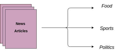
Source: A Comprehensive Guide to Understand and Implement Text Classification in Python
The dataset
I will use the 20 Newsgroups dataset, quoting the official dataset website:
The 20 Newsgroups data set is a collection of approximately 20,000 newsgroup documents, partitioned (nearly) evenly across 20 different newsgroups. The 20 newsgroups collection has become a popular data set for experiments in text applications of machine learning techniques, such as text classification and text clustering. The data is organized into 20 different newsgroups, each corresponding to a different topic. Some of the newsgroups are very closely related to each other (e.g.
comp.sys.ibm.pc.hardware/comp.sys.mac.hardware), while others are highly unrelated (e.gmisc.forsale/soc.religion.christian). Here is a list of the 20 newsgroups, partitioned (more or less) according to subject matter:
| comp.graphics comp.os.ms-windows.misc comp.sys.ibm.pc.hardware comp.sys.mac.hardware comp.windows.x |
rec.autos rec.motorcycles rec.sport.baseball rec.sport.hockey |
sci.crypt sci.electronics sci.med sci.space |
| misc.forsale | talk.politics.misc talk.politics.guns talk.politics.mideast |
talk.religion.misc alt.atheism soc.religion.christian |
A glance through the data
The dataset consists of 18,846 samples divided into 20 classes.
Before jumping right away to the machine learning part (training and validating the model), it’s always better to perform some Exploratory Data Analysis (EDA), Wikipedia’s definition of EDA:
In statistics, exploratory data analysis (EDA) is an approach to analyzing data sets to summarize their main characteristics, often with visual methods. A statistical model can be used or not, but primarily EDA is for seeing what the data can tell us beyond the formal modeling or hypothesis testing task.
I won’t go into detail about the EDA, but a good read about it is this nice article: What is Exploratory Data Analysis?
Simply put, we can say that EDA is the set of methods that helps us to reveal characteristics of the data we’re dealing with, in this post I’ll only perform a few visualization on the data, and see if it needs any further cleaning.
Note: for creating the visualization I’ll use two data visualization libraries:
-
seaborn: Seaborn is a Python data visualization library based on matplotlib. It provides a high-level interface for drawing attractive and informative statistical graphics.
-
Plotly: Plotly’s Python graphing library makes interactive, publication-quality graphs.
Categories Percentages
In a balanced data each class (label) has an (almost) equal number of instances, as opposed to imbalanced data in which the distribution across the classes is not equal, and a few classes have high percentage of the samples, while others have only a low percentage, imbalanced data could cause the model to perform poorly, hence some steps must be performed to solve this issue like dropping the least frequent classes, or joining related classes together, etc …
The following chart shows that the dataset is balanced because classes have a nearly equal number of instances.
Average Article Length
The following chart shows how the average article length varies by category, one might see that the politics articles are very lengthy (especially the middle east ones), compared to tech-related articles.
The classification will be based on the article content (words), and classifiers generally look for words that distinguishably describe the categories, and as observed in the previous chart, some categories (mac_hardware, pc_hardware, …) are short on average which means they have only a handful set of words, this might later explain why the model have low accuracy on classes with short document length.
Word-clouds
The previous two charts gave us only statistical facts about the data, but we’re also interested in the actual content of the data, which is words.
Word-clouds are useful for quickly perceiving the dominant words in data, they depict words in different sizes, the higher the word frequency the bigger its size in the visualization.
The following are 4 word-clouds for grapichs, medicine, sport-hocky, and politics-middle-east categories, generated using this library: WordCloud for Python
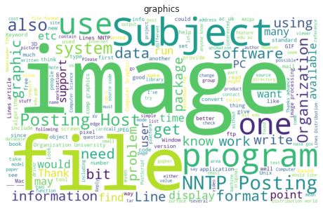

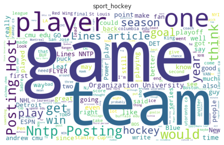
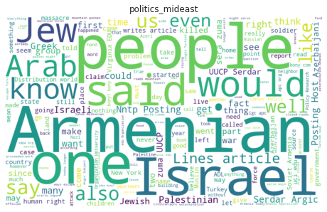
These word-clouds show us what are the most frequent words in each class, words like image, file, game, patient, and arab are useful words for determining the article category, while other words like one, would, also, and said are considered as stop-words, because they are common across the different categories, and they should be removed from the data.
Data splitting
Split the data into 75% training and 25% testing, with stratified sampling, to make sure that the classes percentages in both training and testing data are (nearly) equal.
X = df['text']
y = df['category']
X_train, X_test, y_train, y_test = train_test_split(X, y, random_state=42, stratify=y)
Text vectorization
Note: in this section and in the following one, I’ll draw some ideas from this book (which I really recommend): Applied Text Analysis with Python, the fourth chapter of the book discusses in detail the different vectorization techniques, with sample implementation.
Machine learning algorithms operate only on numerical input, expecting a two-dimensional array of size n_samples, n_features (where rows are samples, and columns are features)
Our current input is a list of varied-length documents, and in order to perform machine learning algorithms on textual data, we need to transform our documents into vector representation.
This process is known as Text Vectorization where documents are mapped into a numerical vector representation of the same size (the resulting vectors must all be of the same size, which is n_feature)
There are different methods of calculating the vector representation, mainly:
-
Frequency Vectors.
-
One-Hot Encoding.
-
Term Frequency–Inverse Document Frequency.
-
Distributed Representation.
Discussing the working of each method is beyond the purpose of this post, here I’ll use the TF-IDF vectorization method.
TF-IDF is a weighting technique, in which every word is assigned a value relative to its rareness, the more common the word is the less weight it’ll be assigned, and rare terms will be assigned higher weights.
The general idea behind this technique is that meaning of a document is encoded in the rare terms it has, for example, in our corpus (a corpus is the set of documents), terms like game, team, hockey, and player will be rare across the corpus, but common in sport articles (articles tagged as hockey), so they should be assigned higher weights, while other terms like one, think, get, and would which occur more frequently across the corpus, but they are less significant for classifying sport articles, and therefore should be assigned lower weights.
For more details and intuition behind the TF-IDF method, I recommend this article: What is TF-IDF?
We can use TfidfVectorizer defined in sklearn to convert our documents to TF-IDF vectors. This vectorizer tokenizes sentences using a simple regular expression pattern, and it doesn’t perform any further text preprocessing (like punctuation removal, special characters removal, stemming, etc …)
We can specify the preprocessing steps we want to do, by overriding the method build_analyzer, for that I’ll create a new class NLTKVectorizer that inherits the TfidfVectorizer, and overrides the build_analyzer method, in this class I’ll create several preprocessing functions (like: tokenization, lemmatization, stop words removal, …) and then plug them all together in one function (analyze_document) that takes a document as input, and returns a list of tokens in this document, the code for this class can be found here: NLTKVectorizer
This class uses NLTK library features: word_tokenize and WordNetLemmatizer.
Pipelines
After creating the vectorizer, our data is now ready to be fed to a classifier:
# TF-IDF vectorizer, with preprocessing steps from NLTK
vectorizer = NLTKVectorizer(stop_words=en_stop_words,
                            max_df=0.5, min_df=10, max_features=10000)

# fit on all the documents
vectorizer.fit(X)

# vectorize the training and testing data
X_train_vect = vectorizer.transform(X_train)
X_test_vect = vectorizer.transform(X_test)

# logistic Regression classifier
lr_clf = LogisticRegression(C=1.0, solver='newton-cg', multi_class='multinomial')

# fit on the training data
lr_clf.fit(X_train_vect, y_train)

# predict using the test data
y_pred = lr_clf.predict(X_test_vect)
In these few lines, we transformed our text documents into TF-IDF vectors, and trained a logistic regression classifier.
The previous case was the simplest scenario of creating a classifier, we only used one data transformation step (the TF-IDF vectorization), but what if we want to add another transformation step?
in our previous setting we stated that the TF-IDF vectors should have 10,000 features (argument max_features=10000), dealing with such high-dimensional vectors is common issue in machine learning known as The Curse of dimensionality which could make the training process much harder and take longer time.
One way to tackle this problem is the use of Dimensionality reduction, we can use a dimensionality reduction algorithm, such as SVD (Singular value decomposition) to reduce the dimension of the TF-IDF vectors:
# TF-IDF vectorizer, with preprocessing steps from NLTK
vectorizer = NLTKVectorizer(stop_words=en_stop_words,
                            max_df=0.5, min_df=10, max_features=10000)

# fit on all the documents
vectorizer.fit(X)

# vectorize the training and testing data
X_train_vect = vectorizer.transform(X_train)
X_test_vect = vectorizer.transform(X_test)

# dimensionality reduction transformer, reduce the vector dimension to only 100
svd = TruncatedSVD(n_componentsint=100)

# reduce the features vector space
X_train_vect_reduced = svd.fit_transform(X_train_vect)
X_test_vect_reduced = svd.fit_transform(X_test_vect)

# logistic Regression classifier
lr_clf = LogisticRegression(C=1.0, solver='newton-cg', multi_class='multinomial')

# fit on the training data
lr_clf.fit(X_train_vect_reduced, y_train)

# predict using the test data
y_pred = lr_clf.predict(X_test_vect_reduced)
We can see what’s happening here: for each data transformation step, we create two variables, one for training and one for testing, which would make the code very hard to debug if anything goes wrong, and if we wanted to change the parameters of a transformer (say the max_features parameter) we would have to run all the transformations steps sequentially from the first one.
Sklearn has a very nice feature for doing these steps elegantly: Pipeline
Pipelines are the recommended approach of combining data processing steps with machine learning steps, they let us seamlessly apply many transformations on the input data, and finally train a model on the produced data.
They are considered as one of the best-practices in sklearn.
Here, we will create a two-steps pipeline, which may doesn’t show how important it is, but it’s very common to create a more complex pipeline consisting of many data transformations steps followed by a machine learning model.
Another bonus of pipelines, is that they can help us to perform cross validation on the data all at once, and tune the hyper-parameters.
# text vectorizer
vectorizer = NLTKVectorizer(stop_words=en_stop_words,
                            max_df=0.5, min_df=10, max_features=10000)

# logistic Regression classifier
lr_clf = LogisticRegression(C=1.0, solver='newton-cg', multi_class='multinomial')

# create pipeline object
pipeline = Pipeline([
    ('vect', vectorizer),
    ('clf', lr_clf)
])
The previous code creates a very minimalistic pipeline consisting of only two steps:
-
Text Vectorizer (Transformer): in this step the vectorizer takes the raw text input, perform some data cleaning, text representation (using TF-IDF), and returns an array of features for each sample in the dataset.
-
Classifier (estimator): the classifier then takes the output produced by the previous step (which is the features matrix), and use it as input to train machine learning algorithm to learn from the data.
In this way, the data will be process first using the vectorizer, and then used to train a classification model.
There are many great resources about the importance of using pipelines, and how to use them:
Hyper-parameter tuning and cross validation
After creating the pipeline object, we can use it like any other estimator that has the methods fit and predict:
# fit the pipeline on the training data
pipeline.fit(X_train, y_train)

# use the pipeline for predicting using test data
y_pred = pipeline.predict(X_test)
But there are two questions here:
-
How can we make sure that the model is not over-fitting on the training data, and it generalizes well on the whole data, the more the model generalizes the better it performs.
-
What is the set of optimal hyper-parameters of our model that yields the best results.
k-fold Cross Validation
For avoiding over-fitting, we need to make sure that the whole data is exposed to the model, so we don’t just fit the model on the training data, instead, we split the training data into k-folds and for each fold we do the following:
-
Train the model using the k-1 folds.
-
Use the remaining fold as a validation set.
After performing the previous two steps for each fold we finally evaluate the final model using the held out test set, the following figure gives a visual explanation of how k-fold works:
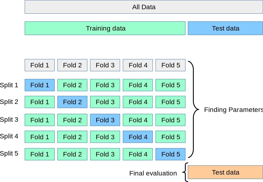
Source: Sklearn documentation
Grid Search
Hyper-parameters are parameters that are not directly learnt by the model, rather, we set them before starting the learning process, and they are passed as arguments for the constructor of transformer and estimator classes, example of hyper-parameters are: ngram_range, max_df, min_df, max_features, C, and different values of these parameters yields different accuracy, so it’s recommended to search the hyper-parameter space, and finding the optimal set of parameters that yields the best accuracy.
Typical approach for searching the optimal parameters is Grid search, which simply performs a brute force search over the specified set of parameters values.
GridSearchCV
Sklearn supports both cross validation and hyper-parameters tuning in one place: GridSearchCV
The first step before using grid search is defining the list of hyper-parameters and the list of values to search over, then we create a GridSearchCV object and pass the pipeline object and the list of parameters to the grid search object.
# Logistic Regression classifier
lr_clf = LogisticRegression(C=1.0, solver='newton-cg', multi_class='multinomial')

# Naive Bayes classifier
nb_clf = MultinomialNB(alpha=0.01)

# SVM classifier
svm_clf = LinearSVC(C=1.0)

# Random Forest classifier
random_forest_clf = RandomForestClassifier(n_estimators=100, criterion='gini',
                                           max_depth=50, random_state=0)

# define the parameters list
parameters = {
    # vectorizer hyper-parameters
    'vect__ngram_range': [(1, 1), (1, 2), (1, 3)],
    'vect__max_df': [0.4, 0.5, 0.6],
    'vect__min_df': [10, 50, 100],
    'vect__max_features': [5000, 10000],
    # classifiers
    'clf': [lr_clf, nb_clf, svm_clf, random_forest_clf]
}

# create grid search object, and use the pipeline as an estimator
grid_search = GridSearchCV(pipeline, parameters, n_jobs=-1)

# fit the grid search on the training data
grid_search.fit(X_train, y_train)

# get the list of optimal parameters
print(grid_search.best_params_)
The parameters list is defined as a python dictionary, where keys are parameters names and values are the corresponding search settings.
Since we’re performing grid search on pipeline, defining the parameters is a bit different, it has the following pattern: step_name__parameter_name.
Interestingly, we can treat the classification step of the pipeline as a hyper-parameter, and search for the optimal classifier, so we create several classification models, and use them as values for the clf parameter.
Next we fit the training data, and then get the best parameters found by the grid search stored in attribute best_params_ in the grid search object.
The results are:
-
ngram_range: using only uni-grams. -
max_df: terms that have a document frequency higher than 50% are ignored. -
min_df: terms that have document frequency strictly lower than 10 are ignored. -
max_features: selecting only 10,000 features. -
clf: the classifier which achieved the highest score is theLinearSVC.
Note: performing grid search with many parameters takes a quite long time, so be careful what parameters to pick, and the list of values to search over.
Model evaluation
Best classifier
After finding the best hyper-parameters, we create a pipeline with those parameters, and use it to fit the data:
vectorizer = NLTKVectorizer(max_df=0.5, min_df=10, ngram_range=(1, 1),
                            max_features=10000, stop_words=en_stop_words)

svm_clf = LinearSVC(C=1.0)

clf = CalibratedClassifierCV(base_estimator=svm_clf, cv=5, method='isotonic')

pipeline = Pipeline([
    ('vect', vectorizer),
    ('clf', clf)
])

pipeline.fit(X_train, y_train)

y_pred = pipeline.predict(X_test)
Evaluation results
Now we evaluate the model performance, the following figure shows the classification report (generated using sklearn’s classification_report) which includes typical classification metrics for each class:
And the following figure shows the confusion matrix:
The model’s weighted average f1-score is 0.88, which is good result, but looking in detail at the f1-score results for each class, we see that the model is performing very poorly on classes sys_ibm_pc_hardware, religion_misc and graphics.
For improving the model’s performance on these classes, we should start by looking into the features that the model had learned for classifying them, and see if we can improve the features by performing some additional preprocessing on the data.
Model explainability
At this point we should be done! we’ve created a multi class classification model, and got somewhat good accuracy.
But what if we want to dig deeper and understand more of how the model is working, in fact there are many questions about how the model is working, for example:
-
How the model makes predictions (what features it uses to predict a particular class).
-
When the model predicts correctly and when it doesn’t.
-
Does the model generalizes on the data.
-
Is this model reliable? can we use it in production with confidence? (most important and relevant question when developing machine learning models)
And we might be interested in debugging the model predictions on certain samples, which can helps us understand when the model is failing, and if we can improve it.
We can think of our model right now more or less like a Black Box, it takes some input, and produce some output, without any explanation.
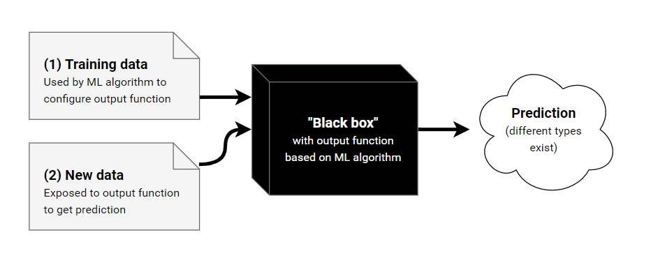
Source: Show Me The Black Box
The field of Explainable artificial intelligence (which is concerned with the tools and methods for explaining and interpreting machine learning algorithms) caught a large interest in the past few years, and there has been many research papers published in this field, and libraries that can be used out of the box for interpreting machine learning and deep learning models:
-
Lime: Explaining the predictions of any machine learning classifier
-
SHAP: A game theoretic approach to explain the output of any machine learning model
These libraries differ in the way they work, and the type of models they can interpret.
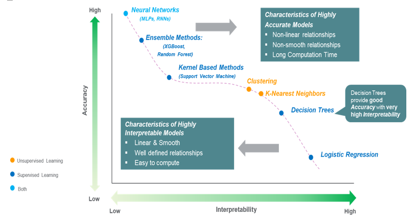
Model complexity vs interpretability
Unfortunately, it’s not easy to explain all models, Simple linear models are easy to explain (since they consists of only linear equations), but their accuracy is low compared to Complex non-linear models, which achieve higher accuracy, but are harder to explain.
The following figure illustrates the relation between model accuracy and interpretability (Source: The balance: Accuracy vs. Interpretability):
Since we’re using a linear SVM classifier, I’ll try to visualize the weights assigned to the features, and see for each class (category) in the data, what are the features that affect the model’s prediction positively and negatively.
Resources about interpreting SVM classifier in sklearn:
Then I’ll use Lime library to explain individual predictions.
Visualizing model’s weights
I’ll include here weights visualizations for the following classes:
Visualizations for the rest of the classes can be found here
These charts show us what the SVM model actually learned from the data, on the left the negative features , which means that if they occurred in a document the corresponding class probability will be very low, whilst the positive features (on the right) increase the class probability.
The influence of a feature (positively or negatively) is shown as the bar size.
Autos class
Graphics class
Medicine class
Politics middle east class
Explaining individual predictions
Note: pardon me for the poor styling in the following sections, but as the time of writing there’s no way to specify any color scheme in the LIME library.
When the model is performing well
The following sample shows how the model predicted the correct class which is politics_mideast with probability 0.96 (almost certain!), and we can see that words like israeli, israel and prison are very informative to make this prediction, so we can say that the model is learning good features.
But on the other hand, the model had also learned noisy features, for example it learned the word omar to predict the class graphics (which is completely wrong), omar in this context refers to a person name (omar jaber), but with the current preprocessing steps this word is treated as a single token, we can improve this behavior by using using a Named-entity recognition library to detect person names and either remove them from the data, or combining the whole person name in one token.
When the model is performing badly
In the following sample, the model had predicted the class forsale while the correct class is autos, but the prediction probabilities for both classes are equal, so the model is a bit confused what to do.
Reading through the article, I myself actually got confused! so the article goes about someone criticizing the idea of posting car-seats ads, and he mentions two car models, the Toyota MR2 and the Toyota Celica, these two words are very informative to recognize the autos class, but it’s hard for the classifier to catch them (since the features are based on frequency statistics), detecting car names also using a Named-entity recognition might improve the prediction results, with the current preprocessing steps the word MR2 is removed in remove_short_tokens step.
Improving accuracy
After inspecting how the model is making predictions, we saw that word MR2 is actually relevant to the classification, but it’s being removed by the analyzer, I’ll change the value of min_token_length to 2, this way only tokens of two letters or less will be removed, and re-train the model and compare the results.
We can see that the f1-score had improved by 0.02 from the previous results, and we can repeat the process of understanding when the model is failing, and introduce new steps to the preprocessing step, until we’re satisfied with the results or the model is not improving anymore.
Final remarks
In this post I talked about the main steps of creating a machine learning model and how to use sklearn API for that, showed the benefit of explaining the model’s prediction to go beyond the accuracy metric and understand what the model is actually doing and how to improve it (if possible).